Description
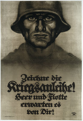
This poster, created for Germanys Seventh War Loan, exemplifies characteristic differences between German and Allied World War I posters. Unlike the bold, colorful posters of Great Britain and America, German posters were often rendered in black and white or with limited, muted colors. They were more somber in appearance and rarely employed humor, a key element in many American war posters. The civilian, a frequent character in Allied posters, seldom appears in German visual propaganda. Instead, the soldier-hero, military leaders, or the Kaiser were the common protagonists. As with this image, the composition in German posters often consists of a single male figure, characteristically portrayed as strong and forbidding. Allied artists often depicted their characters in action, but the figure in German posters is typically motionless. In this poster, the soldier is seen from a low vantage point making him appear both monumental and powerful. German artists were particularly adept at integrating letters and image. In this case, the artist and typographer Lucian Bernhard utilized his own version of the Fraktur font, a typeface with roots in German medieval printing. Gothic fonts were used widely in German World War I posters to evoke earlier traditions of feudalism and chivalry. In addition, the soldier wears one of the newly issued stahlhelm (steel helmets) whose design was based loosely on medieval helmets. The stahlhelm was developed to prevent the head injuries common to trench warfare and officially replaced the well-known nineteenth-century spiked German helmet, the Pickelhaube, in January 1916. The stahlhelm quickly became a symbol of German military prowess.
Details
- Work Date:
- 1917
- Dimensions:
- 55⅛ x 37½ inches
- Medium:
- Color lithograph printed on two panels
- Credit Line:
- Gift of Bartlett H. Hayes, 1985