Description
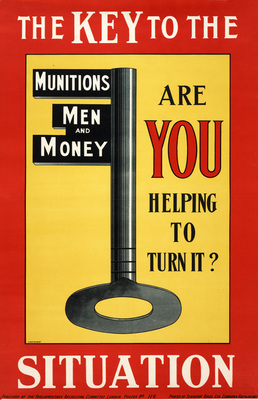
War posters were designed to be hung in public places, often outdoors, where they competed with multiple distractions for peoples attention. It was vital that a posters message be understood quickly and forcefully. Even before the war, the trend in poster design was towards greater simplicity. The challenge for the poster artist was to eliminate all non-essential elements from his/her design while retaining an immediately recognizable image and message. Many World War I posters, from both sides of the conflict, employed a traditional, narrative style recognizable to the average citizen. Yet a few poster artists did play with more minimalist, abstract designs. In this poster, with its bold, modern colors, the artist has managed to tackle three subjects (ammunition, enlistment, and war funding) by reducing everything to the visual and textual pun of the key.
Details
- Work Date:
- 1915
- Medium:
- Color lithograph and screen printing
- Credit Line:
- Gift of Bartlett H. Hayes, 1985